Backlinks for data visualizations: public data that gets cited
Backlinks for data visualizations are easier to earn when you publish a niche chart with credible public data, clear citations, and a reusable reference page.
Why charts often don't earn links
A chart can look great and still get ignored. Most writers won't link unless they can quickly confirm the numbers are correct, current, and safe to cite. If there's any doubt, they pick a source that feels more official.
"Public sources" doesn't just mean "free on the internet." For credibility, it usually means data published by a government agency, university, standards body, public company filings, or a well-known research organization, with a clear way to verify it. A screenshot, a blog quote, or an anonymous spreadsheet is rarely something an editor will stand behind.
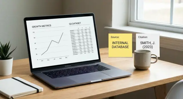
Before they add a link, writers and editors usually need the basics: where the data came from (the original source), when it was collected and last updated, what the metric means (definitions, units, scope), a short note on how you built the chart (and what you excluded), and a stable page they can cite again later.
That's why many "chart posts" fail. They're built for scrolling: headline, graphic, takeaway. A reference page is built for reuse: it answers a cautious writer's questions in 30 seconds.
Example: imagine a journalist writing about EV adoption. They need one chart showing year-over-year registrations. If your page has only an image and a bold claim, they can't tell whether the numbers came from a transport agency report or a repost. If your page names the original dataset, the reporting period, and how you handled missing months, it's the safer citation.
Choosing a niche chart worth citing
Charts that earn citations usually answer one narrow question writers already need to explain. Broad charts like "global internet usage over time" can be interesting, but they're rarely the one source people quote.
Scan the reports, newsletters, and explainers in your niche. Look for sentences that repeat across sites, like "X changed by Y%" or "the average is Z." Those claims need a number, and the best opportunities are the metrics people keep reusing.
Often the chart already exists, but it's outdated, hard to read, or missing key context (time range, geography, definitions). That's your opening. If you publish the clearest, most current version, you can become the default reference.
Before you commit, do a quick sanity check. Can someone cite your chart in one sentence? Is the metric already common in articles (not a score only you use)? Does the chart answer one question, not five? Is there a clear update cycle (monthly, quarterly, yearly)? Is the scope tight enough to be credible?
Example: instead of "remote work trends," publish "percent of job postings labeled remote in US tech roles, by quarter, since 2019." A writer can quote it cleanly, and you can keep it current so your page stays relevant.
How to curate credible public datasets
For charts that attract citations, the dataset matters as much as the design. People link to a graphic when they trust the numbers and can see where they came from.
Start with primary sources when you can. Government portals, regulators, central banks, universities, and official research centers tend to publish the most stable data. Secondary sources (news roundups, scraped dashboards, random GitHub repos) can be fine for ideas, but they're risky as your main source because they may summarize, edit, or "fix" numbers without telling you.
Before you build anything, do a quick credibility pass: who publishes it and are they accountable, how often it's updated (and whether there's a release schedule), whether there's version history or an archive, whether reuse terms are clear (public domain, open license, or written permission), and whether definitions match your chart (units, time period, geography, methodology).
Treat the original dataset like evidence. Download the raw files, keep the filenames as-is, and record the retrieval date. If the publisher provides release notes or a change log, save that too. When someone questions a spike, you can point to the source release instead of guessing.
Watch out for sources that silently revise totals. A common trap is a "live" dashboard that overwrites historical numbers with no explanation. Prefer sources that publish revision notes, or at least keep older snapshots so changes are traceable.
Example: if you're charting monthly renewable energy share, use the regulator's monthly bulletin or a university energy lab dataset, not a blog that reposts a table.
Cleaning the data without losing trust
People only cite charts they believe. The fastest way to lose trust is to quietly "fix" data without saying what you did. Good cleaning is boring, consistent, and easy to explain.
Lock your scope before you touch a spreadsheet: timeframe, geography, and clear exclusions. If your chart is "US only, 2018-2024, excludes territories," write that down and don't change it midway because a gap looks awkward.
Missing values and outliers are where trust usually breaks. Pick a rule, apply it every time, and say it plainly. For example: "If a month is missing, we leave it blank instead of estimating," or "We winsorize the top 1% to reduce reporting spikes." The simplest rule is often best, even if the chart looks less dramatic.
Keep calculations simple enough to follow without special tools. If you create an index, explain the baseline. If you compute a rate, show the numerator and denominator. Avoid stacking multiple transformations unless they're necessary.
A small data dictionary makes reuse and citation easier. It can be a short table or a few lines defining key fields, units, known limitations (delays, undercounts), and your cleaning rules.
Finally, make the chart readable without extra context. Use clear labels, a specific title, and units on the axis. A quick test: if someone screenshots it and shares it without your article, does it still make sense?
Example: if you chart "average response time," say whether it's mean or median, whether weekends are included, and how you handled tickets with no close date.
Build a reference page that earns citations
A chart earns citations when the page behaves like a small source of truth. Make it easy to understand the point, trust the numbers, and copy the details without emailing you.
Above the chart, lead with a takeaway, not a topic. For example: "Remote job postings fell for three straight quarters after 2022, even as total listings rose." That gives writers a reason to use your chart.
Under the chart, add what removes doubt: data sources in plain English (publisher, dataset name, date range), short method notes (filters, definitions, rounding, missing values), a table view so people can verify quickly, a copy-paste-friendly way to reuse the numbers, and a visible "Last updated" date with the dataset version or release date.
Include a short "How to cite this chart" snippet with the exact text you want repeated: chart title, your site name, the last updated date, and the dataset version.
One detail that helps more than it should: keep the chart title and metric name consistent everywhere (headline, axis labels, table header). When someone quotes your metric in a report, they can match your wording and find the page again.
Step-by-step: publish a chart people can cite
A chart gets cited when it answers one clear question, shows how the number was made, and stays stable over time.
Start by writing the chart question in one sentence, then define the metric with zero wiggle room. Example: "What share of commuters in City X use public transit?" and "percentage of workers commuting by public transportation, ACS 1-year, age 16+."
Then follow a simple workflow: lock the metric and scope (geography, time range, population, numerator/denominator), collect sources and record details (dataset name, publisher, table or series ID, date accessed, filters), clean and calculate with a change log (removed rows, mapped categories, rounding rules), design for clarity (units, labels, a short "What this shows" note, key caveats), and publish a reference page that includes the chart, the data table (or key values), the methodology, and a copy-paste citation.
Example: if you combine two public tables to make one "cost per user" metric, write the formula in plain language and show the two inputs.
Keep it updated without making it messy
Match your update routine to the source release cycle (monthly, quarterly, yearly). Add an "Updated on" date and note major changes (for example, "2024 method change: category definitions updated"). Consistency matters more than frequency.
Clear citations and methodology notes
Treat your chart like a mini research report. Trust comes from showing where the numbers came from and what you did to them.
Use one citation format everywhere. Keep it consistent and easy to copy:
- Author (or agency), Organization, Date, Dataset or table title
- Source publication (if different), Version (if available), Accessed date
- Notes if needed (table ID, series code, geographic scope)
Methodology notes should be plain language. Explain transformations as small, checkable steps: what you filtered out, what you combined, how you handled missing values, and whether you adjusted for inflation or seasonality. If definitions changed across years, say so.
Separate facts from interpretation. Put the data and rules first, then keep your commentary clearly labeled as your take. That way, a journalist can cite the number without inheriting your opinion.
Make quoting easy with a one-line summary that includes the key number, unit, place, and time period. Example: "In 2024, City Z recorded 18.2 incidents per 100,000 residents (public records, compiled by our team)."
A short FAQ can prevent back-and-forth: how often it's updated, what's included and excluded, the biggest limitations, and whether reuse is allowed (and what attribution you want).
How to get the right people to notice your chart
A good chart can still get ignored if it never reaches the people who already write about that metric. The fastest path is simple: find writers who need updated numbers, and make it painless for them to cite you.
Build a list of "already interested" publishers: newsletters, bloggers, analysts, and reporters who covered the same metric in the last 1-3 years. Older posts are strong targets because they often contain stale figures and editors are open to quick fixes.
To prioritize without turning this into a full-time job, pick 20-30 pages that mention the metric and a year, put the most outdated or most shared pieces at the top, note whether the author is still active and where they accept updates, and flag posts that use screenshots or unclear sources (they're more likely to appreciate a cleaner reference).
Your message should be short and specific: what changed, why it matters, and exactly how to cite. Offer two ready-to-use assets: a small image version of the chart for quick swaps, and a plain-text citation they can paste.
Example: if a SaaS blog has a "2022 churn benchmark" post, you can send: "The 2024 dataset is out. I've updated the chart and added methodology notes. Suggested citation: [Title], [Publisher], [Date], [Dataset source]."
Track outreach in a simple sheet (date, status, next step). Follow up once after 5-7 days, then stop.
Common mistakes that stop backlinks
Most charts fail for simple reasons: people can't verify them fast, can't quote them safely, or don't trust what they're seeing.
Circular sourcing kills trust. If your "source" is a blog post quoting another blog, editors will skip it. Start with the original publisher (government portal, research institute, exchange, regulator, or a company's primary report) and make that obvious.
Messy provenance is another problem. When you mix dataset versions, update figures without notes, or hide the exact table and date, readers can't reproduce your numbers. Even if it's correct, it feels slippery.
Common link-killers include relying on secondary writeups instead of the original dataset, combining sources without stating what came from where (and which release you used), designing the chart like a poster (tiny labels, heavy effects, low contrast), changing the title or page location after people start citing it, and making headline claims the data doesn't support (implying causation from correlation).
Example: you publish a chart on "average rent vs salary" and it gets shared. Two months later you swap in a new dataset, change the title, and move the page. Anyone who cited it now points to something different or broken, so they stop trusting your work.
Quick pre-publish checklist
Before you publish, do a two-minute pass like a reader who wants to cite you. If anything feels vague, they'll move on.
Credibility check
Make sure the chart answers one specific question in plain words. A good test: can you say what it proves in one sentence without extra context?
Name the source organization, the exact dataset (not just the website), and the date you pulled it. If the dataset updates, note the version or release.
Right before you hit publish, confirm you have: a clear chart question as the page title or first heading, every source listed with publisher name, dataset name, and access or release date, a short methodology note (how you calculated it and what you excluded), a copy-paste citation block (one or two lines) with page title and last updated date, and a visible "Last updated" plus dataset version.
Usability check
Open the page on your phone. If labels are tiny or the legend overlaps, it won't get shared.
Add a small table view under the chart. Many journalists and analysts will screenshot or copy values from a table even when they cite the chart, and that extra convenience can be the reason they reference your page instead of someone else's.
Example: becoming the reference page for one metric
A small benefits consulting firm published a single page tracking one metric: the average employer health insurance premium in the US, split by plan type and year. The data came from the same public source every time (a yearly government survey), and the page stayed narrow instead of trying to cover "all benefits stats."
Within a month, the chart started getting cited by HR blogs, a few SaaS comparison posts, and two local business journals. Not because the design was fancy, but because quoting the number was painless.
What made it linkable was straightforward: the chart answered one question quickly, the "How to cite this chart" snippet sat directly under the graphic, the last updated date was visible with a small changelog, and the page explained what the metric includes and excludes.
In the first week, the creator drove early citations by emailing a small set of writers who already covered the topic, posting the chart in a couple niche communities with a practical "use this if you need the yearly figure" note, replying to journalist requests with a copy-ready quote line, and asking a few partners to update older posts.
To keep it current, they set one calendar reminder for the survey release month, updated the dataset in under an hour, and logged the change.
Next steps: turn one good chart into steady links
One strong chart can keep earning citations if you treat it like a small product: upkeep, consistency, and a plan for what comes next.
Pick one chart to publish this month, then set an update date (monthly, quarterly, or yearly). Updates give writers a reason to cite you again because they can say they used the latest numbers. Even if nothing changes, confirming it's still current builds trust.
Create a simple page template you can reuse: a one-sentence takeaway above the chart, a visible last updated date and coverage period, a source list with a short methodology note, a copy-friendly way to reuse the data, and a short "How to cite" snippet.
If you're building links intentionally and your reference page is already citation-ready, a small boost can help the right editors discover it sooner. SEOBoosty (seoboosty.com) focuses on securing premium backlinks from highly authoritative websites, which can be useful once your chart page is solid and stable enough to deserve long-term citations.
FAQ
My chart looks good—why isn’t anyone linking to it?
Because most writers are risk-averse. If they can’t verify the numbers quickly, confirm the date range, and understand what’s included, they’ll cite a source that feels more official and easier to defend to an editor.
What counts as a “credible public source” for chart data?
Usually it means a primary, accountable publisher with stable documents or tables, like a government agency, university, regulator, standards body, or public company filings. “Somewhere online” isn’t enough if a reader can’t trace the numbers back to the original release.
What do writers need to see before they’ll cite a chart?
They need the original source name, the exact dataset or table, the coverage period, and a clear “last updated” date. They also need definitions and units so the metric can be quoted without guessing what it means.
How do I choose a chart topic that’s actually link-worthy?
Pick a single narrow question people already write about and can quote in one sentence. If your chart answers five questions at once, it’s harder to reuse and easier to replace with something simpler.
How do I spot a “citation gap” in my niche?
Look for metrics that appear repeatedly across articles, reports, and newsletters, especially where posts are outdated or vague about sources. If you can publish the clearest, most current version with better context, you have a real chance to become the default reference.
How do I avoid using data that gets silently revised?
Prefer sources with a release schedule, version history, or an archive. “Live dashboards” that overwrite historical numbers without notes are risky because you can’t explain why your chart changed later.
How much data cleaning is okay without hurting trust?
Make your cleaning rules boring and explicit. Lock your scope first, use consistent handling for missing values or outliers, and say what you did in plain language so someone can reproduce the number without trusting you blindly.
What should a “reference page” include to earn citations?
Keep the chart stable, then support it with a quick-verification section: sources, date range, method notes, and a small table view of the values. Add a short “How to cite this chart” snippet so people can copy the exact wording you want repeated.
How often should I update a chart page?
Match your update cadence to the source release cycle and show an “Updated on” date. If your method or definitions change, note the change clearly so old citations don’t suddenly point to a different meaning.
When does it make sense to use SEOBoosty for a chart-based link strategy?
First make the page citation-ready and stable so it deserves long-term references. If you want faster discovery from high-authority publishers, a service like SEOBoosty can help place premium backlinks, but it works best when your chart page already makes verification and citation effortless.