Backlinks for how-it-works pages: make explainers rank
Learn how backlinks for how-it-works pages can boost mid-funnel rankings with intent-matched headings, smart supporting links, and clear copy that converts.
Why "How it works" pages usually underperform in search
A "How it works" page has a simple job: explain the process, reduce doubt, and help someone feel confident taking the next step (pricing, signup, demo, purchase). Most of the time it’s written for people who already know the brand and just need clarity.
Search engines reward pages that answer a specific question for a specific search. Many explainers stay broad so they can work for everyone. That often makes them less helpful for any one query. They also tend to be short, visual-heavy, and light on text, which gives Google very little to index beyond a few generic lines.
Another trap: these pages can look busy without ranking. They may get visits from navigation, email, and paid campaigns, so the team assumes the page is “performing.” Organic search works differently. If the wording and intent don’t match what people actually type, the page gets outranked by tutorials, reviews, and comparisons that feel more complete.
If you want your explainer to be findable, treat it like a real SEO page, not a UI screen. That usually means writing headings that match search intent, adding plain-language detail where readers expect it, connecting the explainer to a few supporting pages that prove depth (use cases, FAQs, integrations, pricing), and earning a small number of relevant links so the page isn’t an authority orphan.
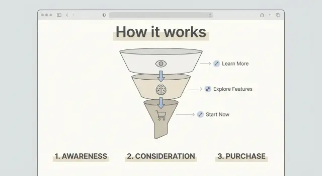
A common missed win: the page promises “3 steps,” but the steps aren’t named in the headings. Make the steps explicit, answer the obvious “what happens next?” questions, and then promote the page once it’s solid.
The intent behind "How it works" searches
A "How it works" search is usually mid-funnel. The person isn’t browsing for fun, and they’re not ready to buy on the spot either. They’re trying to decide whether your product fits their situation and whether it feels safe to try.
This is why links and credibility signals matter here. The explainer is often the moment where someone moves from interest to trust. A strong page answers practical doubts, and credible mentions from other sites can make those answers feel more believable.
Most people are really asking questions like:
- How long does setup take, and what do I need?
- What does it cost, and what’s included?
- Will this work for my use case, team size, or tech stack?
- What are the risks (lock-in, downtime, learning curve)?
- What happens after I start (support, results timeline, cancellation)?
That intent should shape the page. A vague story about your mission won’t help someone comparing options. Use clear sections that match buyer questions, place proof close to the claims, and show one realistic walkthrough.
If someone searches “how does a backlink subscription work,” they want the steps (pick a domain, start a plan, point the link). They also want guardrails: what they can control, what they can’t, and what a normal first month looks like.
Mid-funnel visitors also skim. Make the page easy to scan with simple headings, a short process summary near the top, and a small FAQ that covers pricing, timing, and risk in plain language.
When backlinks are worth pursuing for explainers
Backlinks can help a "How it works" page rank, but only when the page already does its job. Links are a trust signal, not a fix for unclear writing.
A page is worth promoting when it gives other sites something specific to reference. That usually means clear steps, a process that feels distinct (not generic), and proof that the process is real. Proof doesn’t need to be fancy: concrete outcomes, screenshots, numbers, short customer quotes, or a brief “what happens behind the scenes” section that shows you actually run the system.
Links help most when you’re competing for terms where the top results already have strong authority, when your site is new, or when few sites link to your domain. In those cases, even a well-written explainer can stall without outside signals.
Links are usually wasted when the explainer is vague, short, or interchangeable. If the page could be copied onto a competitor’s site with minimal edits, authority won’t save it. The same goes for pages with no supporting content to back up claims.
Before you invest in link building for an explainer, make sure:
- The steps are concrete, in order, and easy to skim.
- The page includes at least one credible detail (numbers, screenshots, examples).
- Supporting pages exist for “what, why, pricing, limits, and FAQs.”
- The main promise matches what users will see after signup.
If your page claims “no waiting,” show what happens immediately after purchase or setup so a visitor (and a reviewer) can trust the claim.
Intent-matched headings that make the page easier to rank
Many "How it works" pages fail because the headings are written for insiders. Searchers are trying to answer practical questions quickly. When your headings match those questions, the page becomes easier to understand for both people and search engines.
Start by collecting phrases you hear in sales calls, support tickets, and demos. The best headings often sound plain because they mirror how people search.
What to include in your core headings
Most explainers work best with 5 to 8 main sections that cover the full decision path. For a service or SaaS product, a strong set often includes:
- What you get (deliverables)
- How long it takes (timeline)
- What you need to provide (setup)
- Privacy and security (data handling)
- Pricing and cancellation basics
Add a short “Who this is for” block near the top. Keep it honest: one sentence for the best-fit customer, one sentence for who should not buy. It reduces bounces and helps the page match the right intent.
Then add proof high on the page, right after the first summary. Logos are optional. Outcomes and constraints are better: what improved, how long it took, and what the customer had to do. A line like “Typical results appear after X weeks once Y is in place” is more useful than broad promises.
Turn the process into steps search engines can understand
A "How it works" page ranks better when the process reads like a real sequence, not a marketing story. Think of it as a recipe: each step should have a clear start and a clear finish.
For each step, spell out the input and the output. The input is what the visitor does or provides. The output is what they get right after. That makes the page easier to skim and easier for search engines to interpret.
A simple pattern that fits most products:
- Step 1: What the user starts with, and what they see next.
- Step 2: The key action (choose, connect, approve) and the result it creates.
- Step 3: What happens behind the scenes, and how long it usually takes.
- Step 4: Delivery and confirmation (what “done” looks like and where to find it).
Add time boxes without overpromising. Use ranges and explain what affects timing. Mention one or two edge cases that cause delays, plus what speeds things up. People search for these details, and they often decide whether to continue based on them.
If you can, include one supportive visual per major step (a labeled screenshot or a simple diagram). Keep it functional, not decorative.
Keep each step short. Put deeper answers in an FAQ below the steps so the main flow stays clean.
Supporting content and internal links that add depth
A good explainer answers the main question fast, then gives readers (and search engines) clear paths to the details. The goal is depth without turning the page into a wall of links.
Think of the explainer as a map and supporting pages as zoomed-in views. Strong support pages often include an objection-focused FAQ, a pricing breakdown, integrations pages for “will it work with my stack?”, and case studies for proof.
What should be its own page vs staying on the explainer
Keep something on the explainer if it’s required to understand the flow (the basic steps, the promise, and key requirements). Give it its own page when it’s a repeat question that needs real detail, or when it has its own search demand.
A simple rule: if a section needs more than a short paragraph to be clear, or if it answers a different intent (like pricing or integrations), split it out and link to it.
Internal links that feel natural (not clutter)
Place internal links where the question naturally comes up.
For example: in Step 2 (“Connect your account”), add one link to “Supported integrations” right after you mention tools. In the section that mentions cost, link once to pricing details. Avoid repeating the same link across the page just to add more internal linking.
A practical keyword plan for one explainer and its satellites
Pick one main topic that matches what the page actually explains. Examples: “how invoice factoring works,” “how a password manager works,” or “how same-day delivery works.” That becomes the single target for your explainer, the query someone types right before comparing options.
Then add 3 to 6 supporting subtopics that answer the next questions people ask after the basics. These become satellite pages (or short supporting sections if you already have them). This structure also makes promotion easier because other sites have more natural angles to reference than one all-in-one page.
Common satellites include pricing mechanics, timelines, requirements, risks and limits, and a comparison angle (vs alternatives, and when it’s a bad fit).
When you map keywords to the explainer, keep it strict: one idea per section. If a section tries to target two intents, it reads messy and rankings often stall. Use headings that match the searcher’s wording, not internal terms.
A quick one-page brief you can reuse
Before you edit, write a short brief:
- Working title (main topic + clear outcome)
- H2 plan (4 to 6 sections, each tied to one intent)
- 3 to 5 FAQs pulled from real support and sales questions
- Proof points (numbers, policies, screenshots, examples)
- Next action (what the reader should do after they understand it)
What should be indexable (and what should not)
Avoid duplicating your pricing page, feature page, or documentation. If a section is essentially the same content, rewrite it to add new meaning, or keep it out of the index and point to the canonical page instead.
Each satellite should have one clear job: answer one question better than the explainer can, then send readers back to the next step.
Step by step: build backlinks without breaking the page experience
Start by choosing one clear angle for the page. A "How it works" explainer can be about the product flow (what happens after you click Buy), the onboarding flow (setup and first success), or the service delivery flow (what you do vs what the team does). Mixing all three makes it harder for other sites to describe and harder for search engines to place.
Next, decide what you’ll promote. The explainer is usually the primary target, but it shouldn’t stand alone. Choose 1 to 2 supporting pages that build trust, like a pricing page with clear inclusions, a security page, or a case study.
A clean sequence that protects the reading experience:
- Make the promise clear in the first paragraph using the wording someone would search.
- Add two internal links in natural spots: one to proof and one to the next step (pricing, signup, demo).
- Choose link sources with the same audience and topic. A smaller, highly relevant publication often beats a random high-authority site.
- Spread links over time and vary anchors. Use mostly brand or page-title anchors, with a few descriptive ones.
- Track outcomes weekly: rankings for mid-funnel queries, time on page, and assisted conversions.
Example: a payroll tool tightens its onboarding explainer around “set up in 15 minutes.” Most links point to the explainer, while a smaller number point to a security overview and a customer story. The page stays readable, and the signals support a clear intent.
Common mistakes that stop "How it works" pages from ranking
Most explainers fail because they’re written like internal documentation, then promoted like a landing page. If you want link building to help, the page has to match real search intent and stay useful after the click.
Mistake 1: Headings that make sense only inside your company
Teams use feature names, acronyms, or project terms in H2s because that’s how they talk internally. Searchers don’t. “How pricing works” or “What happens after you sign up” beats “Workflow Orchestration Layer” every time.
Mistake 2: A page that’s too short to earn trust
Thin explainers rarely rank because they leave out what people need to decide. Add the parts that reduce doubt: limits, timelines, requirements, what can go wrong, and a small example. Even one realistic scenario can turn a skim into a read.
Mistake 3: Internal links that point to the wrong places
Some pages only link to the homepage, or they dump readers into random blog posts. Link to the next question instead: pricing, integrations, security, FAQs, setup guides.
Mistake 4: Repeating the same anchor text everywhere
If every link uses the same keyword phrase, it looks unnatural and reads poorly. Use plain anchors that fit the sentence, and vary wording based on what the destination page actually covers.
Mistake 5: Building links to a moving target
Don’t push links to a URL you keep renaming, redesigning, or rewriting into something thinner. Get the page stable first.
Quick checklist before you send backlinks to the page
Backlinks amplify what’s already clear. If the page is confusing, extra authority just pushes more people into a dead end. Before you invest in links, do a final pass for clarity, structure, and usefulness.
- The first screen says what the user gets, roughly how long it takes, and who it’s meant for.
- Your H2s read like real buyer questions: how to get started, what it costs, what affects pricing, what you need before you begin, what can go wrong, and how support works.
- Each step ends with something concrete: a file delivered, a setting changed, a choice made, or a clear yes/no decision.
- You include a small set of genuinely helpful supporting reads (about 3 to 5) that reduce doubt.
- The last section has one simple next action that matches the reader’s stage.
A simple test: ask someone who has never seen your product to read the page for 60 seconds. Then ask, “What happens first, what happens last, and what would you do next?” If they hesitate, fix that before you build links.
Example scenario: upgrading one explainer into a ranking asset
A SaaS company had an onboarding explainer called “How does Acme Onboarding work?” It hovered at the bottom of page 2 for “how does onboarding software work” and brought in a few visits, but almost no demo requests.
Before the upgrade, the page looked fine to humans but weak to search engines. Headings were vague (“Overview,” “Features”), the flow jumped around, and there was no proof the process actually worked. It also stood alone, with no supporting pages to answer common questions or build trust.
After the upgrade, the page was rebuilt around headings that mirror what people want to confirm:
- What it does (in one sentence)
- How it works (step by step)
- What you need to set it up
- How long it takes and what you get
- Security and data handling
They also published two support pages: a “Setup checklist” and a trust-focused page on security and compliance. The explainer linked to both, and both linked back, so the cluster felt complete.
For promotion, most links went to the main explainer to lift the core ranking, with a smaller set going to the security page to strengthen trust signals.
Over the next 4 to 8 weeks, they watched three things: ranking lift for “how does X work” terms, qualified visits (time on page and clicks into pricing or signup), and conversion assists (demo requests after at least one visit to the explainer).
Next steps: a simple rollout plan you can repeat
Pick one "How it works" page to upgrade first. Choose the one closest to revenue: the page people read right before they compare options. Define one main query it should win, and keep it tight.
Before you build links, make the page feel complete for a cautious buyer. Most explainers fail because they skip the questions people are silently asking: price, setup time, risks, and what happens if it doesn’t work.
A repeatable 10-day rollout
- Day 1: Lock the main query and rewrite top headings to match what the searcher expects.
- Days 2-4: Create or refresh 1 to 2 supporting pages that answer the biggest objections.
- Days 5-6: Add clear internal links between the explainer and those support pages.
- Days 7-10: Add backlinks in a controlled way, then watch rankings and conversions before adding more.
How to keep it controlled
Limit changes so you can see what worked. If rankings move but signups drop, the page may be attracting the wrong intent. If signups rise but traffic stays flat, you likely need more authority.
If you want predictable placements without long outreach cycles, some teams use SEOBoosty (seoboosty.com) to secure premium backlinks from authoritative sites. It works best as the final step, once the explainer reads like the best answer on the page.
FAQ
Why do “How it works” pages usually underperform in organic search?
Most “How it works” pages are written for existing prospects, not for a specific search query. They stay broad, use vague headings, and rely on visuals instead of plain text, so search engines have little to index and users don’t get the exact answers they searched for.
Which “How it works” page should I optimize first?
Pick the one closest to a buying decision, where readers typically go right before pricing, signup, or a demo. If the page is already part of your sales flow, improving its search intent match can add qualified traffic without changing the funnel.
How do I choose the main keyword for a “How it works” page?
Treat it like one page with one primary topic. Choose a main query that matches the real explanation on the page, then make every section support that single idea instead of trying to rank for pricing, features, and comparisons all at once.
What headings help a “How it works” page rank better?
Use headings that sound like buyer questions, not internal terms. Clear sections like what you get, how long it takes, what you need to provide, what it costs (at a high level), and what happens after you start tend to match what people actually want to confirm.
How should I write the steps so both users and Google understand them?
Write the process as a real sequence with a clear start and finish for each step. For every step, state what the user does or provides, then what they get immediately after, so the flow is easy to skim and hard to misunderstand.
What kind of “proof” should I include on the page?
Add one or two concrete details that prove the process is real, such as typical time ranges, a simple example scenario, a policy constraint, or what “done” looks like. The goal is to reduce doubt, not to add hype.
How many internal links should a “How it works” page have, and where should they go?
Link out only when the reader naturally has a follow-up question, like pricing details, integrations, security, or a setup checklist. Keep the explainer focused on the main flow, and use supporting pages for deeper answers so the page doesn’t become cluttered.
When are backlinks actually worth building for a “How it works” page?
Backlinks help most when the page already answers the query well but still can’t compete on authority, especially on newer sites or tougher terms. If the page is vague or interchangeable, links won’t fix it; they’ll just send more people to a page that doesn’t convert.
How do I build links to an explainer without hurting the page experience?
Stabilize the URL and the content first, then promote a clear angle rather than a mixed message. Use mostly brand or page-title anchors, spread placements over time, and keep the page readable by limiting promo-driven edits after links go live.
How do I measure whether the upgraded page is working?
Track rankings for the mid-funnel queries you’re targeting, plus on-page engagement like time on page and clicks into pricing, signup, or demo. The best signal is assisted conversions, where the explainer shows up as a step that helped someone decide.