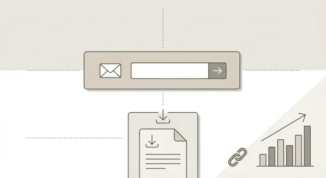
Backlinks for lead magnet landing pages that rank and convert
Learn how backlinks for lead magnet landing pages can improve rankings while still driving newsletter sign-ups and downloads with simple SEO and copy changes.
Why lead magnet landing pages often underperform
Most lead magnet pages fail because they commit to one goal and neglect the other.
Some are built like pure conversion pages: short, persuasive, and mostly form-focused. They can convert, but they often have too little substance to rank.
Others are built to rank: long, keyword-heavy pages where the opt-in gets buried, trust is unclear, and visitors leave without subscribing.
Backlinks can help a lead magnet page, but they don’t fix weak fundamentals. A good link mainly does three things: it increases trust with search engines, improves discoverability (the page gets crawled and found more often), and gives you a chance to compete against stronger domains. It still won’t convince the right person to share their email.
The real goal isn’t more traffic. It’s more qualified visitors. If someone clicks expecting a detailed guide and lands on a thin download gate, they bounce. That tells search engines the page didn’t satisfy the query, and it tells you the visit wasn’t a fit.
Avoid sending links straight to the sign-up page when the offer is too narrow for broad keywords, the page is mostly a form with little context, the topic is competitive and you can’t explain value fast, or the lead magnet needs proof before people trust it.
A better approach is a “bridge” page that matches search intent (a helpful explainer or resource hub), then a clear path to the sign-up. For example, keep the checklist behind the form, but use a public page to explain who it’s for, what problem it solves, and what’s inside.
What makes newsletter and download pages tricky for SEO
Lead magnet SEO is harder than normal content SEO because most people searching on Google want an answer first, not a form. That gap between search intent (learn) and page goal (subscribe or download) is the main reason these pages struggle to rank.
The intent mismatch: “help me” vs “sign me up”
A typical query is informational: “email templates for sales follow-up” or “checklist for onboarding.” If the searcher lands on a page that immediately asks for an email, it can feel like a paywall. They bounce, and the page sends weak signals to search engines.
Thin pages are a second problem. A landing page with just a headline, a couple lines of copy, and a form often looks “light” compared to the pages it competes with. Even with links, it may not hold rankings because it doesn’t satisfy the query as well as richer pages.
Minimal design vs enough context
You don’t need to turn a landing page into a blog post. You do need enough substance to feel real and trustworthy.
The elements that usually make the difference are straightforward: a clear promise (what they get and who it’s for), a quick preview (sample pages, an outline, or a short excerpt), one proof point if you have it (a testimonial or small result, only if true), practical details (format, length, delivery timing), and a plain privacy note explaining what happens after they enter their email.
If you offer a “30-minute onboarding checklist,” include a short excerpt and a sentence about when to use it. People feel the value before they commit, and the page has more to rank for.
On-page setup that supports both rankings and sign-ups
A lead magnet page works best when it has one job in Google and one job for humans.
Pick a single search theme per page based on the exact topic of your newsletter or download. If you try to rank for three different ideas, the page becomes vague and visitors hesitate.
Your H1 should be plain and literal, not clever. Write it the way someone would search, then confirm the match in the first two lines. For example: “Weekly B2B pricing email examples (free newsletter)” beats “Join our insights.” When the topic signal and the opt-in offer point in the same direction, links tend to help more.
Add a few answer blocks below the hero
You don’t need a long article, but you do need enough content to remove doubt.
A simple structure that works well is:
- Who it’s for (role, stage, problem)
- What you get (format, frequency, file type, length)
- How it works (sign-up to delivery)
- One proof point (short and real)
Keep each block to a few sentences, and write it in the same words your audience uses.
Make the form easy, visible, and honest
Keep the form close to the top with a clear button label like “Get the PDF” or “Subscribe.” Avoid tricks like hiding the email field until the last second.
Ask only for what you truly need (often just an email), and state what happens next: “We’ll send a confirmation email, then the download link.”
Make the page worth linking to without turning it into a blog post
People link to pages that help them make a decision quickly.
Start with a short, concrete preview: what’s inside, the format (PDF, checklist, email series), and the time it takes to use. “7-page PDF, 10-minute read, includes 3 templates” beats vague promises.
Add a small trust block near the form in normal language. Mention who made it (name and role), why you’re credible (one or two proof points), and a plain privacy note. Writers link more confidently when they can quickly judge the source, and visitors sign up more often when they know what happens after they submit.
A lightweight FAQ can also do a lot of work without turning the page into a full article. Keep it focused on real objections: delivery method, frequency (for newsletters), cost, unsubscribe, and what happens if someone is already subscribed.
Also think about the confirmation page (what people see after signup). If you want it to help SEO, you can keep it indexable and add a short recap plus “check your inbox” instructions. If you want to keep things cleaner, make it non-indexable and use it purely for delivery and tracking.
Step-by-step: prepare a lead magnet page for backlinks
Before you build links, decide what you actually want people to link to.
Some offers work best when links point straight to the opt-in page. Others perform better when links point to a supporting page (a short guide, comparison, or resource hub) that then funnels visitors to the form.
A simple prep flow:
- Choose the destination: the opt-in page or a supporting page that earns the link.
- Pick one primary phrase and mirror it in the title tag, H1, and first few lines.
- Add a few internal links from relevant pages you already have using natural wording.
- Add structured data only when it fits (Organization, and FAQ only if the questions are on the page).
- Publish, then test on mobile for speed and layout issues before outreach or paid placements.
Internal links matter more than most teams expect. If your landing page is isolated, new backlinks have to do all the work. A few well-placed internal links help search engines understand the page faster, and they send visitors from high-intent pages to your offer.
Finally, keep the page stable for a few weeks once you start promoting it. If you change the title, H1, offer, or URL too often, it gets harder to see what the links actually changed.
Where backlinks should point and what anchor text to use
The first decision is simple: should the click land on the opt-in page, or on a page that warms people up first?
Point links directly to the landing page when intent is already high and specific, like “free invoice template download” or “weekly product marketing newsletter.” People clicking those links are ready to act.
Send links to a supporting article when the topic is broader or the audience needs proof before handing over an email. A short guide can rank for wider queries, earn links more easily, and then funnel readers to the lead magnet with one strong internal link.
Anchor text that looks natural
Anchor text should sound like something a human would actually write. Avoid repeating the exact same keyword across every placement.
Natural anchor patterns include brand or product name, partial matches (“newsletter landing page”), descriptive phrases (“free checklist,” “download the template”), a plain URL-style mention, and generic anchors used sparingly (“this guide”).
Small additions that make people more willing to link
Most people don’t link to a page that feels like a dead end. A simple opt-in can convert, but it gives writers little to reference.
A few small content blocks make citations easier without turning the page into a full article:
- A preview (excerpt, sample template, or a short outline)
- One mini proof block (a small stat from your own work, if it’s real)
- A short “who this is for” section with 2 to 3 specific audience types
Make it easy to quote something. A small “what you’ll get” box with specifics (pages, time to use, audience, problem solved) gives writers a clean way to describe the resource.
How to measure success: rankings, traffic quality, and sign-ups
Success isn’t just more traffic. You want better rankings, the right visitors, and steady sign-ups.
Start with rankings, but keep it focused. Track one main query that matches the page’s promise, plus a few close variations. For a newsletter landing page optimization effort, that might include the core topic plus “newsletter” and “weekly updates” terms. For SEO for download pages, include “template,” “checklist,” or “PDF” variations only if the page truly offers that.
Then watch traffic quality and outcomes together:
- Average position for your main query and a few related queries
- New users by channel (search vs referral vs email)
- Conversion rate (sign-ups or downloads) by source
- Bounce rate and time on page for referral visitors
- Assisted conversions (people who sign up later after a first visit)
If a new backlink sends visitors who bounce instantly and never scroll, something is off: the link framing may promise the wrong thing, the anchor text may mislead, or the landing page may feel too “salesy” for that audience.
Test changes one at a time so you know what worked. Good single-change tests include headline wording, the preview content, and form placement.
Common mistakes that waste backlinks and hurt conversions
The fastest way to waste good links is to point them at a page that gives Google and people almost nothing to work with. If your download or newsletter page is basically a headline, an email field, and a button, link building for landing pages rarely moves the needle.
Another common problem is anchor text that tries too hard. When every site links with the exact same keyword, it can look unnatural. Most real links use brand names, page titles, or simple phrases like “this checklist.”
The mistakes that show up most often:
- Thin page content (no clear topic, audience, outcome, or context)
- Overly repetitive anchors across many links
- Aggressive gating with no preview or proof
- Confusing follow-up flow (unclear confirmation and delivery)
- URL changes after promotion (dead pages or redirect chains)
Gating is especially tricky. You can protect the asset while still being transparent. A simple summary, a short table of what’s inside, and a described preview often removes doubt without giving away the whole thing.
Don’t ignore what happens after the form. If someone signs up and lands on a vague thank-you page, you lose the conversion you worked for. Make it obvious whether they should check their inbox, confirm their email, or download immediately.
Quick checklist before you build links
Before you spend time or money on backlinks, make sure the page deserves the attention.
Confirm these five basics:
- The offer is instantly clear in the first screen (what it is, who it’s for, what to do next).
- One search theme is baked into the title, H1, and opening lines.
- There’s a real preview of what’s inside.
- Trust is visible before the form (real author/team, simple privacy note, proof only if true).
- You’ve decided where links should land (direct-to-landing vs content-then-landing).
If you can’t check all five, pause link building and fix the page first. It usually improves conversion rate and makes new links more valuable.
Example scenario: turning backlinks into sign-ups without friction
A B2B founder runs a small analytics SaaS and wants more qualified leads without spending hours on cold outreach. They promote two offers: a weekly newsletter for nurturing and a free reporting template download for immediate value.
Instead of pushing backlinks straight to the sign-up page, they publish one supporting article answering a common problem their ideal customer searches for, like “how to build a simple KPI dashboard for a small team.” The article is practical and ends with a natural next step: “Get the template used in this guide.” That call to action points to the template landing page.
They build links in two phases. First, links to the supporting article to earn rankings and pull in steady search traffic. Then, once the funnel is working, a smaller number of links directly to the landing page to increase trust and visibility.
To keep sign-ups friction-free, the landing page loads fast, repeats the promise in plain words, shows what’s inside (preview + a few benefits + who it’s for), and delivers the file clearly after signup.
Next steps: a simple plan to improve both SEO and conversions
Pick one lead magnet page to focus on this week. Fixing five pages at once usually creates half-finished changes and no clear results.
Write down the three biggest trust gaps a first-time visitor might feel in the first 10 seconds. Common ones are: “Who is this for?”, “Is this real?”, and “What do I get after I sign up?” Add small, specific proof to close those gaps.
Then choose your backlink approach:
- Direct-to-landing: best when the page already has a solid preview and clear value.
- Content-then-landing: best when you need a helpful page to earn links first, then send readers to the opt-in.
Set a simple testing rhythm. Change one thing per week so you know what caused the lift.
If you don’t have time for outreach, a curated service can be a practical option. For example, SEOBoosty (seoboosty.com) offers premium backlinks from authoritative sites, which can work well when you already have a bridge page and an opt-in page that are clear, stable, and built to convert.
Track two numbers side by side: search visits that actually stay on the page, and sign-ups per 100 visitors. Improving both is the goal.